Preflight before print
File preparation for label printing
Send artwork as PDF, AI or CDR, in CMYK, at 1:1 scale, with the background extended 2 mm outside the contour and all text converted to outlines. Draw the cut line on a separate spot channel named "Cutcontour" so it never gets printed.
- Accepted formats
- PDF, AI, CDR
- Colour space
- CMYK
- Image resolution
- 1200 dpi or vector
- Background margin
- 2 mm outside the contour
- Safe area
- 2 mm inside the trim
- Print format
- Custom formats
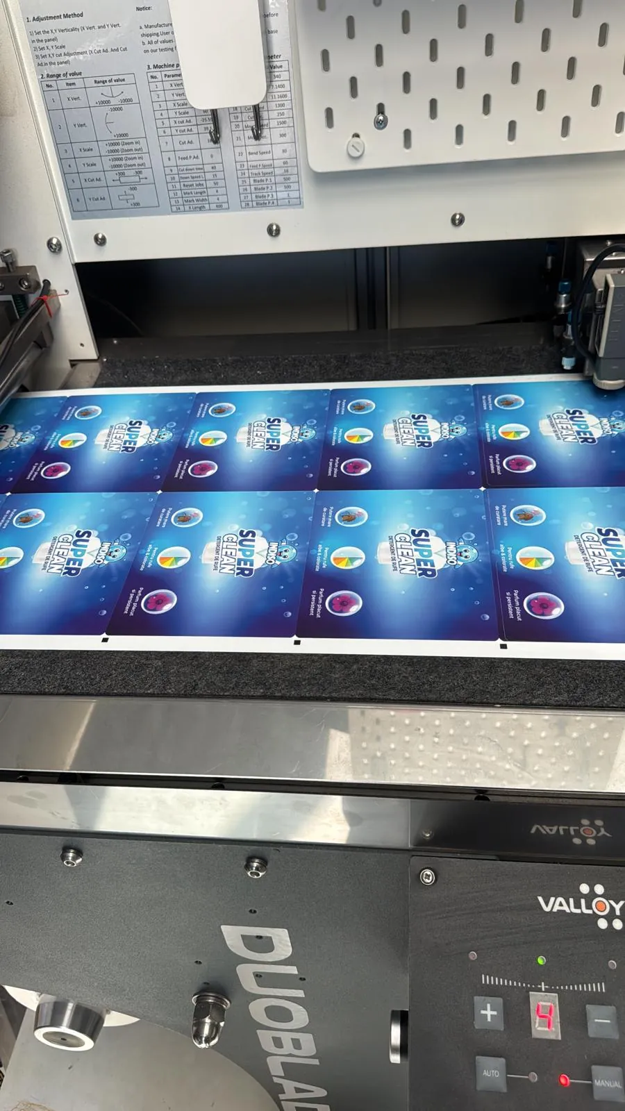
Die-cut · Brașov
Checklist
What a print-ready file looks like
PDF, AI or CDR
PDF is the safest: it keeps fonts and transparency exactly as you saw them. We can export from AI or CDR, but send the fonts or outline the text first.
CMYK, not RGB
RGB files get converted automatically and colours shift, especially bright greens and electric blues. Convert to CMYK yourself so you see the real result up front.
1200 dpi or vector
Raster images must be 1200 dpi at final print size. Logos, text, barcodes and the dieline should be vector so they stay sharp at any size.
Background extended 2 mm
Background colour or image must extend 2 mm past the cut line on every side, otherwise you get white slivers after die-cutting.
Safe area for text
Keep text and logos at least 2 mm inside the cut line. On round or oval labels leave more, because off-centre text is spotted instantly.
Text converted to outlines
Outlines remove any risk of font substitution. If you want us to be able to fix a typo, also send an editable version plus the fonts.
Dieline on its own spot colour
Draw the cut contour as a vector line in a spot colour named "Cutcontour", set to overprint. Do not draw it in CMYK black, it will get printed.
Vector barcodes
The barcode must be drawn as a vector, dark on a light background, never scaled below 80% of nominal size. That is how scanners and POS readers read it correctly.
White ink on clear stock
On clear PP, white is printed as a separate layer. Mark the white areas on a dedicated layer named "White" so we know exactly where it goes.
Real dimensions, 1:1 scale
Build the artwork at the label's final size, not enlarged. We confirm the format together at preflight, based on the product.
Preflight
Mistakes we catch most often
Every file goes through a manual preflight before it hits the press. These are the issues that show up week after week.
Artwork sent as a JPG or PNG out of Word
Resolution is too low, text goes soft in print and there is no cut line. We have to rebuild the artwork in vector, which costs extra time.
Wrongly built black
Small black text should be K 100 only. Rich black (C40 M30 Y30 K100) is for large areas, otherwise you get coloured fringes around text.
Cut line drawn in CMYK
If it is not a separate spot colour, the contour is actually printed on the label. You end up with a thin visible line on the edge.
Barcode scaled, coloured badly or raster
A barcode must be vector, dark on a light background, not the other way around, and never scaled below 80% of nominal size, or POS readers will fail it.
Coloured background stopping on the contour
Cutting tolerance is a few tenths of a millimetre. Without an extended background, part of the run comes out with a white edge.
Unflattened transparency and effects
Shadows and blend modes from Illustrator can render differently at the RIP. Export PDF/X-4 or flatten the effects before sending.
Sending the file
Three steps from artwork to quote
Send the file
By email or WhatsApp, directly or via WeTransfer / Google Drive if it is over 20 MB. One file per product, clearly named.
Put the spec in the message
Material, label size in mm, quantity, finish (matte lamination, gloss lamination, hot foil) and what surface the label goes on.
You get preflight plus a quote
We check the file, tell you exactly what needs fixing, and send the technical quote within 24 working hours.
FAQ
Questions about artwork
PDF, AI and CDR. A PDF/X-4 export is the safest option because it preserves fonts, transparency and spot channels exactly as you built them. Logos, barcodes and the dieline must be vector, and raster images must be 1200 dpi at final size.
2 mm on every side, plus a 2 mm inner safe area for text and logos. On round or oval shapes keep key elements even further from the edge.
Yes, outlines remove the risk of font substitution. If you want us to be able to fix a typo, also send the editable version with the fonts attached.
As a vector stroke with no fill, in a spot colour named "Cutcontour", set to overprint and placed on its own layer. Do not use CMYK black.
As a vector, dark on a light background, never scaled below 80% of nominal size. That is how scanners and POS readers read it correctly.
We convert it to CMYK, but saturated colours can shift visibly. To avoid surprises, convert it yourself and check your critical brand shades first.
We confirm the format at preflight. If the layout exceeds the usable web width, we split it or change the label orientation and tell you exactly what we do.
QUOTE